US Names by State: Part I (Mary is everywhere!)

I was browsing the Social Security Administration’s website and found a link for the open government initiative (http://www.ssa.gov/open/data/). There seems to be a fair amount of interesting data here, but I grabbed the names of people born in the US since 1910 (http://www.ssa.gov/oact/babynames/limits.html). Each state has a data file that lists the number of births under a given name by year in that state and the gender of the child.

There’s a lot of interesting analysis that could be done with this data, but I’m going to start by just plotting the most popular name by state by gender across the entire dataset (after 1910).

Here is the plot for males:

Male

We can see that John is most popular in the Mid-Atlantic (PA, NY, etc.) Robert is most popular in the Midwest and the northeastern states. James dominates large portions of the South while Michael is most popular in the West, Southwest and Florida.

Here is the plot for females:

Female

Mary was the most popular name basically everywhere in the country (with the exceptions of CA and NV where there were more Jennifers).

It’s interesting to see how dominant Mary is across the entire country while the males names seem to have more regional dominance. It is particularly unusual because states tended to have many more distinct female names than male names.

More analysis will follow, but here is the code…

###### Settings
library(plyr)
library(maps)
setwd("C:/Blog/StateName")
files<-list.files()
files<-files[grepl(".TXT",files)]
files<-files[files!="DC.TXT"]
 
###### State structure
regions1=c("alabama","arizona","arkansas","california","colorado","connecticut","delaware",
	"florida","georgia","idaho","illinois","indiana","iowa","kansas",
	"kentucky","louisiana","maine","maryland","massachusetts:main","michigan:south","minnesota",
	"mississippi","missouri","montana","nebraska","nevada","new hampshire","new jersey",
	"new mexico","new york:main","north carolina:main","north dakota","ohio","oklahoma",
	"oregon","pennsylvania","rhode island","south carolina","south dakota","tennessee",
	"texas","utah","vermont","virginia:main","washington:main","west virginia",
	"wisconsin","wyoming")
 
mat<-as.data.frame(cbind(regions1,NA,NA))
mat$V2<-as.character(mat$V2)
mat$V3<-as.character(mat$V3)
 
###### Reading files
for (i in 1:length(files))
	{
	data<-read.csv(files[i],header=F)
	colnames(data)<-c("State","Gender","Year","Name","People")
	data1<-ddply(data,.(Name,Gender),summarise,SUM=sum(People))
	male1<-data1[data1$Gender=="M",]
	female1<-data1[data1$Gender=="F",]
	male1<-male1[order(male1$SUM,decreasing=TRUE),]
	female1<-female1[order(female1$SUM,decreasing=TRUE),]
 
	mat$V2[grep(tolower(state.name[grep(data$State[1], state.abb)]),mat$regions1)]<-as.character(male1$Name[1])
	mat$V3[grep(tolower(state.name[grep(data$State[1], state.abb)]),mat$regions1)]<-as.character(female1$Name[1])
	}
 
jpeg("Male.jpeg",width=1200,height=800,quality=100)
map("state",fill=TRUE,col="skyblue")
map.text(add=TRUE,"state",regions=regions1,labels=mat$V2)
title("Most Popular Male Name (since 1910) by State")
dev.off()
 
jpeg("Female.jpeg",width=1200,height=800,quality=100)
map("state",fill=TRUE,col="pink")
map.text(add=TRUE,"state",regions=regions1,labels=mat$V3)
title("Most Popular Female Name (since 1910) by State")
dev.off()

Created by Pretty R at inside-R.org

Basketball Data Part III – BMI: Does it Matter?

For those of you who are just joining us, please refer back to the previous two posts referencing scraping XML data and length of NBA career by position. The next idea I wanted to explore was whether BMI had any effect on the length of NBA careers.

Originally, I had expected centers to have relatively short careers (based on the premise that ridiculous height/weight -> shorter careers). In the previous post, I find that centers have normal careers, even longer than forwards on average. So now I want to see if larger players in general have shorter careers. Do those players with higher BMIs last fewer years in the NBA?

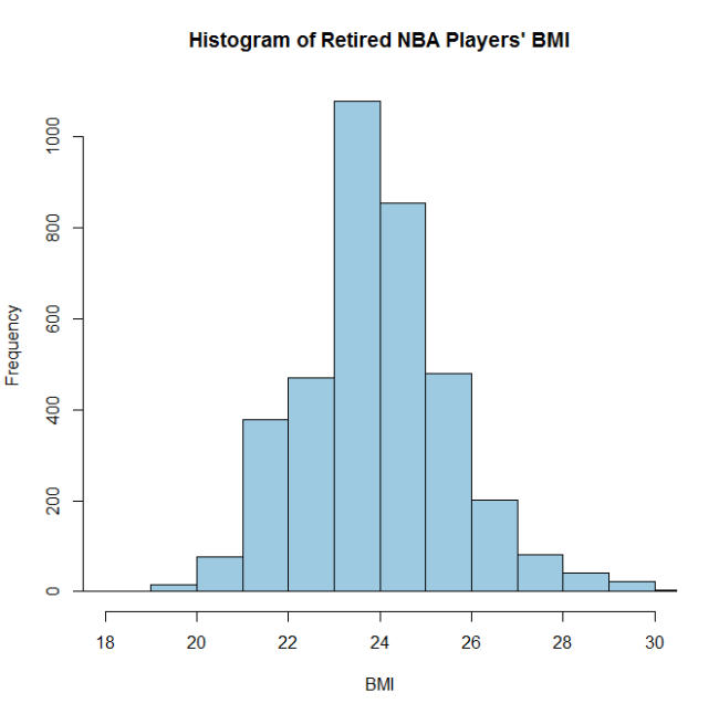
I begin by looking at the BMI distribution for all retired NBA players:ImageThe distribution appears to be fairly normal and the center is around 24. (Note: normal BMIs range between 18.5 and 25, so a fair number of these athletes were “overweight” or had huge muscles.)

Next, I plotted BMI by position:ImageAs one would expect, centers have the highest BMI, followed by forwards, followed by guards. Dual position G-Fs have BMIs between guards and forwards (as expected), but dual position C-Fs average lower BMIs than centers or forwards.

Finally, I plotted career length by BMI:Image

It doesn’t look like there is much relationship between BMI and career length. I ran a simple linear regression model and confirmed that BMI is not a statistically significant predictor of career length.

Image

It does appear that outliers on both edges of the BMI distribution do have longer careers. These sample sizes are quite small, but my theory is that these players were so exceptional that they made it to the NBA despite their unusual body types (too big and too small). Their high level of skill led to longer than average careers.

Image

###### Settings
library(XML)
library(RColorBrewer)
col.9<-brewer.pal(9,"Blues")
setwd("C:/Blog/Basketball")
 
###### URLs
url<-paste0("http://www.basketball-reference.com/players/",letters,"/")
len<-length(url)
 
###### Reading data
tbl<-readHTMLTable(url[1])[[1]]
 
for (i in 2:len)
	{tbl<-rbind(tbl,readHTMLTable(url[i])[[1]])}
 
###### Formatting data
colnames(tbl)<-c("Name","StartYear","EndYear","Position","Height","Weight","BirthDate","College")
tbl$BirthDate<-as.Date(tbl$BirthDate,format="%B %d, %Y")
 
tbl$StartYear<-as.numeric(as.character(tbl$StartYear))
tbl$EndYear<-as.numeric(as.character(tbl$EndYear))
 
tbl$Position[tbl$Position=="F-C"]<-"C-F"
tbl$Position[tbl$Position=="F-G"]<-"G-F"
tbl$Position<-factor(tbl$Position,levels=c("C","G","F","C-F","G-F"))
 
###### Career Length
tbl$LEN<-tbl$EndYear-tbl$StartYear
 
table(tbl$Position)
boxplot(tbl$LEN~tbl$Position,col="light blue",ylab="Years",xlab="Position",
	main="Length of Career by Position")
 
###### Age at Retirement
tbl$RetireAge<-tbl$EndYear-as.numeric(substr(tbl$BirthDate,0,4))
 
boxplot(tbl$RetireAge~tbl$Position,col="light blue",ylab="Retirement Age",xlab="Position",
	main="Retirement Age by Position")
 
###### Removing Currently Active Players
retired<-tbl[tbl$EndYear<2014,]
 
boxplot(tbl$LEN~tbl$Position,col="light blue",ylab="Years",xlab="Position",
	main="Length of Career by Position")
 
boxplot(tbl$RetireAge~tbl$Position,col="light blue",ylab="Retirement Age",xlab="Position",
	main="Retirement Age by Position")
 
###### BMI Calculation
retired$Height<-as.character(retired$Height)
retired$Weight<-as.numeric(as.character(retired$Weight))
retired$HeightInches<-sapply(strsplit(retired$Height,"-"),function(x) as.numeric(x[1])*12+as.numeric(x[2]))
retired$BMI<-(retired$Weight/(retired$HeightInches^2))*703
 
hist(retired$BMI,col=col.9[4],xlim=c(18,30),xlab="BMI",main="Histogram of Retired NBA Players' BMI")
 
par(mar=c(6,5,5,3))
boxplot(retired$BMI~retired$Position,col=col.9[5],yaxt="n",ylab="BMI (Body Mass Index)",xlab="Position",
	main="BMI by Position")
axis(2,at=seq(18,30,by=2),labels=seq(18,30,by=2))
axis(4,at=seq(18,30,by=2),labels=seq(18,30,by=2))
for (i in seq(16,34,by=1))
	{abline(h=i,lty=3,col="lightgray")}
 
model1<-lm(retired$LEN~retired$BMI)
summary(model1)
 
retired$BMI_GROUP<-cut(retired$BMI,breaks=c(0,18,20,22,24,26,28,30,9999),
	labels=c("<=18","18-20","20-22","22-24","24-26","26-28","28-30","30+"))
 
# Removing Players without Weight Info
retired1<-retired[!is.na(retired$BMI),]
 
boxplot(retired1$LEN~retired1$BMI_GROUP,col=col.9[7],xlab="BMI Group",ylab="Career Length (yrs)",
	main="Career Length by BMI")
axis(4,at=seq(0,20,by=5),labels=seq(0,20,by=5))
table(retired1$BMI_GROUP)
 
retired1[retired1$BMI_GROUP %in% c("<=18","18-20","30+"),c("Name","StartYear","EndYear",
	"Position","LEN","Height","Weight","BMI")]

Created by Pretty R at inside-R.org

Basketball Data Part II – Length of Career by Position

In a previous post, I showed how easy it is to use R to scrape XML tables from websites; I used the XML package to scrape some basic basketball data. In this post, I’ll explore the idea that NBA career length might vary by position. Before reviewing this data, I assumed that centers (and big men in general) would have the shortest NBA careers. My theory was that these guys were just too big to stay healthy long enough to string together a career. Let’s see what the data says:

Image

It seems like the median career length is two years for centers, guards and forwards. We can see that centers and guards tend to have longer careers than forwards in general. If we look and C-F and G-F, we can see that these players average significantly longer careers than single position players. I don’t know a lot about basketball, so it’s difficult for me to speculate why these players have longer careers. Maybe they’re so athletic that they can easily play either position and more athletic players tend to have longer careers? Maybe these players have been in the league so long that they get moved around and thus earn the “C-F” or “G-F” designation? Any theories from people who know more about basketball?

I also looked briefly at retirement age:

Image

We can see a similar trend here with centers and guards retiring later than forwards (and C-F/G-F players retiring later than all single position players). More than 75% of forwards retire from the NBA before their 30s. I’m 29 now. Good thing I’m not a forward…

Here is the code:

###### Settings
library(XML)
setwd("C:/Blog/Basketball")
 
###### URLs
url<-paste0("http://www.basketball-reference.com/players/",letters,"/")
len<-length(url)
 
###### Reading data
tbl<-readHTMLTable(url[1])[[1]]
 
for (i in 2:len)
	{tbl<-rbind(tbl,readHTMLTable(url[i])[[1]])}
 
###### Formatting data
colnames(tbl)<-c("Name","StartYear","EndYear","Position","Height","Weight","BirthDate","College")
tbl$BirthDate<-as.Date(tbl$BirthDate,format="%B %d, %Y")
 
tbl$StartYear<-as.numeric(as.character(tbl$StartYear))
tbl$EndYear<-as.numeric(as.character(tbl$EndYear))
 
tbl$Position[tbl$Position=="F-C"]<-"C-F"
tbl$Position[tbl$Position=="F-G"]<-"G-F"
tbl$Position<-factor(tbl$Position,levels=c("C","G","F","C-F","G-F"))
 
###### Career Length
tbl$LEN<-tbl$EndYear-tbl$StartYear
 
table(tbl$Position)
boxplot(tbl$LEN~tbl$Position,col="light blue",ylab="Years",xlab="Position",
	main="Length of Career by Position")
 
###### Age at Retirement
tbl$RetireAge<-tbl$EndYear-as.numeric(substr(tbl$BirthDate,0,4))
 
boxplot(tbl$RetireAge~tbl$Position,col="light blue",ylab="Retirement Age",xlab="Position",
	main="Retirement Age by Position")
 
###### Removing Currently Active Players
retired<-tbl[tbl$EndYear<2014,]
 
boxplot(tbl$LEN~tbl$Position,col="light blue",ylab="Years",xlab="Position",
	main="Length of Career by Position")
 
boxplot(tbl$RetireAge~tbl$Position,col="light blue",ylab="Retirement Age",xlab="Position",
	main="Retirement Age by Position")

Created by Pretty R at inside-R.org

US Population by Ethnicity Visualization

US Census 2011 (ACS) – choroplethr

As a statistician, I’ve always had a soft spot in my heart for the US Census. I love the rich data sets that are made publicly available and I’ve often experimented with visualizing the results. A couple of months ago, Ari Lamstein (a data scientist at Trulia) released the choroplethr package on CRAN (a repository for R packages). I pulled it up a couple of days ago and found it be simple and intuitive. Only a couple of simple commands are required to build plots like this: USPop

1) Go to http://www.census.gov/developers/tos/key_request.html to get a ACS API key.
2) Visit http://factfinder2.census.gov/faces/affhelp/jsf/pages/metadata.xhtml?lang=en&type=survey&id=survey.en.ACS_ACS to find the appropriate ACS table ID for the attribute that you’re looking to explore.
3) Open up R, install choroplethr package, define your API key using the api.key.install() command
4) Explore away!

I started looking at the US population split by ethnicity.
USPopWhite

USPopBlack

USPopAsian

We can see very clearly the heavier concentrations of African-Americans in the Southeastern states, the Eastern seaboard and Southern CA. Asian-American population centers are focused on the West Coast and the NE Coast.

The R code is shown below:

###### Settings
library(choroplethr)
library(acs)
library(ggplot2)
 
###### API key
# Need to go to http://www.census.gov/developers/tos/key_request.html to set API key
api.key.install("###############")
 
###### Basic ACS Table IDs 
# B19301 = Per Capita Income
# B01003 = Population
 
###### Plotting
## Basic by State
choroplethr_acs(tableId="B19301",lod="state")
choroplethr_acs(tableId="B19301",lod="state",showLabels=FALSE)
choroplethr_acs(tableId="B19301",lod="state",showLabels=FALSE,num_buckets=9)
choroplethr_acs(tableId="B19301",lod="state",showLabels=FALSE,num_buckets=9)+labs(title="US 2011 Per Capita Income by State")
 
## Per Capita Income by County
choroplethr_acs(tableId="B19301",lod="county")
choroplethr_acs(tableId="B19301",lod="county",num_buckets=9,states=c("CA"))
 
## Population by County by Ethnicity
choroplethr_acs(tableId="B01003",lod="county")+labs(title="Total US Population by County (2011)")
choroplethr_acs(tableId="B02008",lod="county")+labs(title="US Population by County (2011) - White")
choroplethr_acs(tableId="B02009",lod="county")+labs(title="US Population by County (2011) - Black ")
choroplethr_acs(tableId="B02011",lod="county")+labs(title="US Population by County (2011) - Asian")
choroplethr_acs(tableId="B03001",lod="county")+labs(title="US Population by County (2011) - Hispanic")